Font Animation -- 29LT Zarid Stencil
A modern type structure combined with a vintage aesthetic. The tension between these opposing qualities highlights the versatility and expressive range of the typeface.
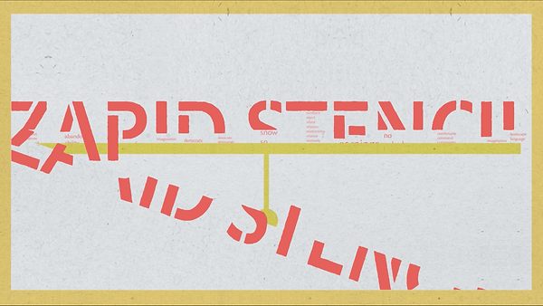
STILLS


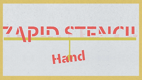


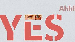


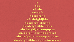

This work was inspired by 20th-century European graphic design, particularly the publication “ABZ: More Alphabets and Other Signs.” The book documents poster designs and typographic developments from the 20th century, with its color palettes and visual language serving as the primary reference for this project. The design was further developed by incorporating the distinctive characteristics of the typeface “29LT Zarid Stencil.”
The combination of modern typography with retro colors and stylistic elements creates a visual aesthetic where past and present intersect. The precision of contemporary design contrasts with the vintage visual tone, resulting in a layered and dynamic visual experience. It reflects a sense of nostalgia while simultaneously expressing innovation. This deliberate fusion of old and new is exactly the balance I strive to achieve.
